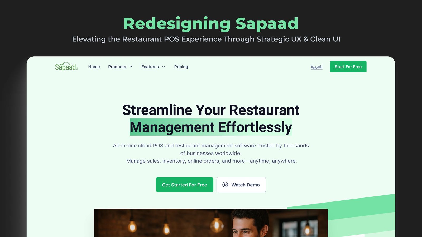
Sapaad is a powerful cloud-based POS system built for restaurants. While packed with essential features, its website suffered from cluttered layouts, unclear messaging and a lack of emotional connection.
The Problem
Restaurant owners and managers looking for a reliable POS solution found Sapaad’s website hard to navigate: cluttered layouts, redundant content and no clear calls to action. That confusion makes it harder to understand the product’s value, and it can send them to alternatives with more intuitive online experiences.
I led the homepage and pricing page redesign to address these pain points and reintroduce the product in a more modern, engaging and user-centric way.
How I Approached It
- Audit the current site: I reviewed the pain points in messaging, hierarchy and visual clarity, and studied the user journeys, especially discovering features, pricing and taking action.
- Benchmark competitors: I analyzed top POS systems like Toast, Square and TouchBistro and noted what worked: emotional storytelling, strong CTAs and simplified pricing.
- Define the UX problems: a mixed visual hierarchy, redundant sections, weak CTAs (“learn more” over “get started”) and a tone that lacked a human connection.
- Follow four principles: clarity, consistency, empathy, and a focus on conversion.
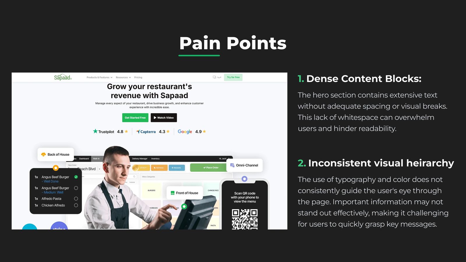
The Pain Points
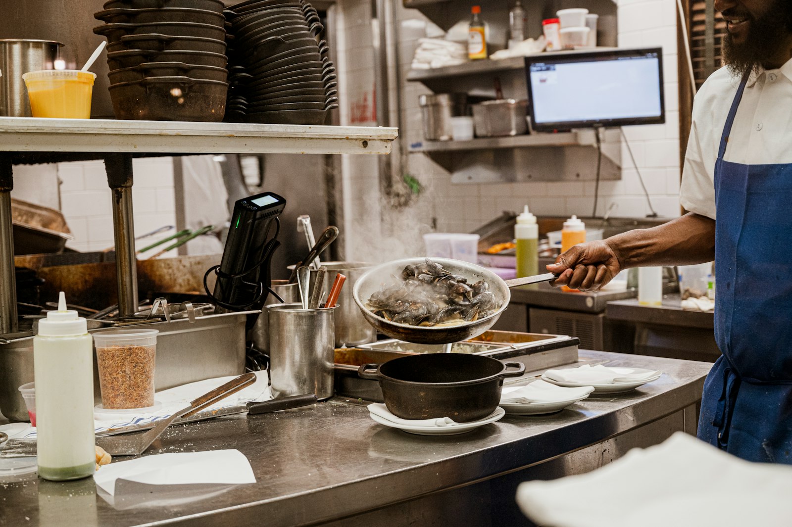
The hero section contained extensive text without adequate spacing or visual breaks. That lack of whitespace can overwhelm users and hurt readability, and the typography and color did not consistently guide the eye.
The website has a lot of features but a poor way of showing them. The feature section was repeated without consistency and without defining the difference between a benefit and an actual feature of the system. The first feature section had no “show all features” button; the second one did, and having both may confuse users. And the benefits page you reach from “see all benefits” looked like a remix of the homepage.
What I Did
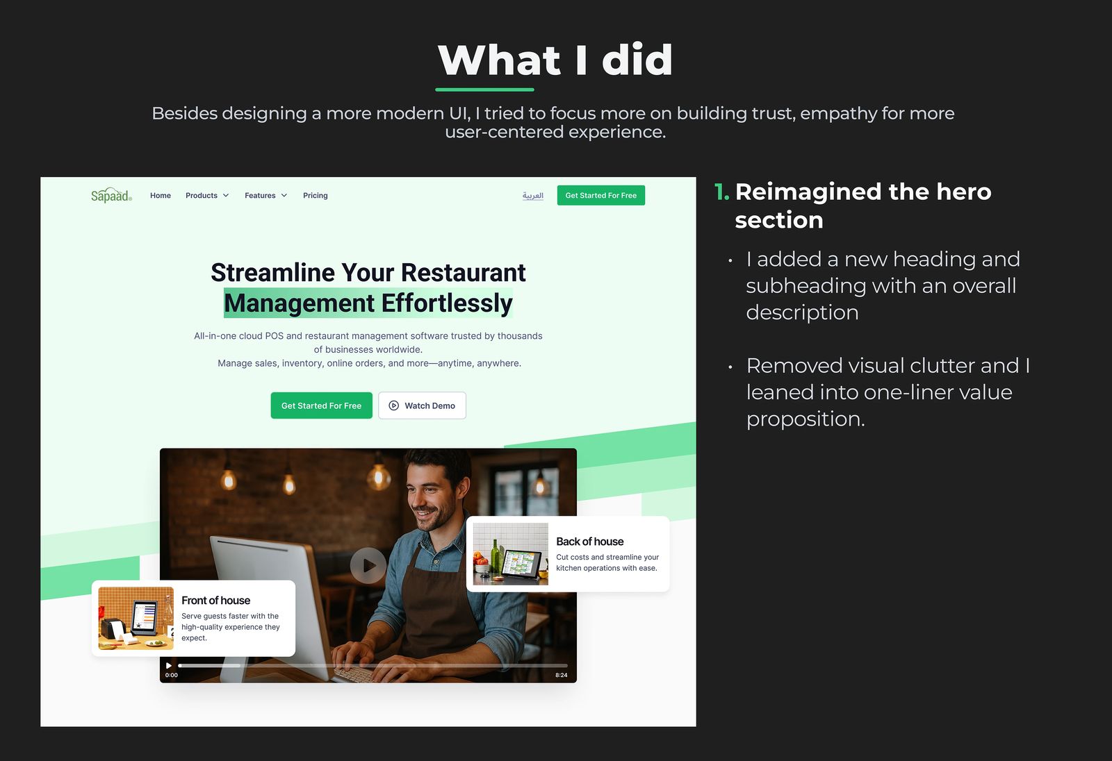
Besides designing a more modern UI, I focused on building trust and empathy, for a more human experience.
- I reimagined the hero section: a new heading and subheading with an overall description, less visual clutter and a one-line value proposition.
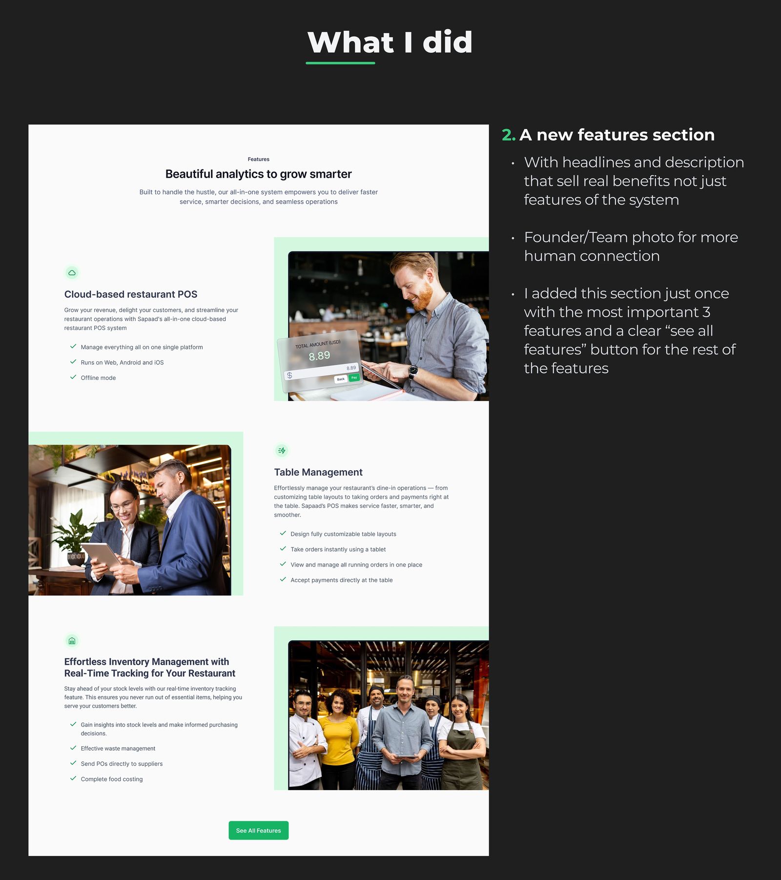
- A new features section with headlines and descriptions that sell real benefits, not just features of the system, and a founder and team photo for a more human connection.
- I added that section only once, with the three most important features and a clear “see all features” button for the rest.
The Footer Counts Too
Every pixel has a purpose, even the footer. Instead of stuffing it with links, I treated it like a conversion opportunity: clarity first, simpler navigation, a final CTA to capture interest, and a mobile-first layout. It’s easy to overlook the bottom of a page, but that’s exactly where undecided users make their final decisions.