
The Brief
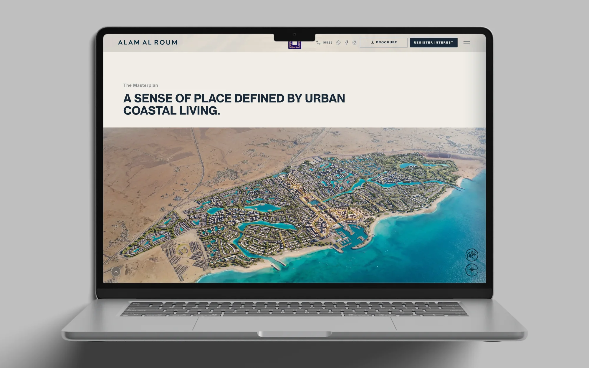
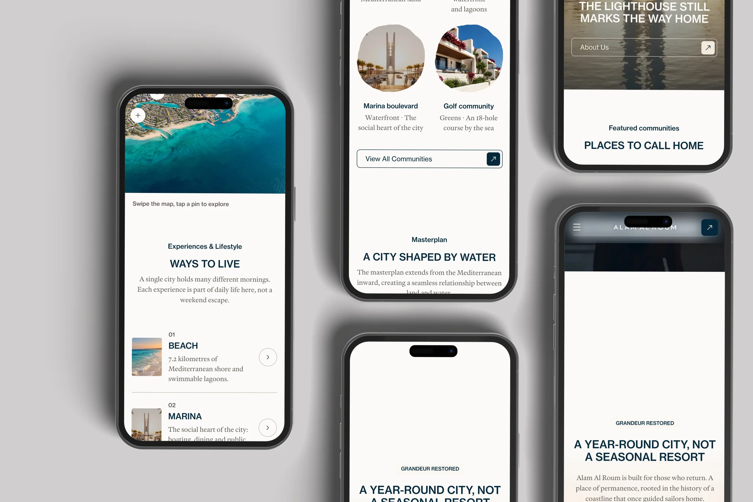
Alam Al Roum is a coastal development whose landing page carries the whole brand: a seal, a coastline and a promise. The job was to rebuild that page on a modern stack, and to reconstruct the same page in Figma.
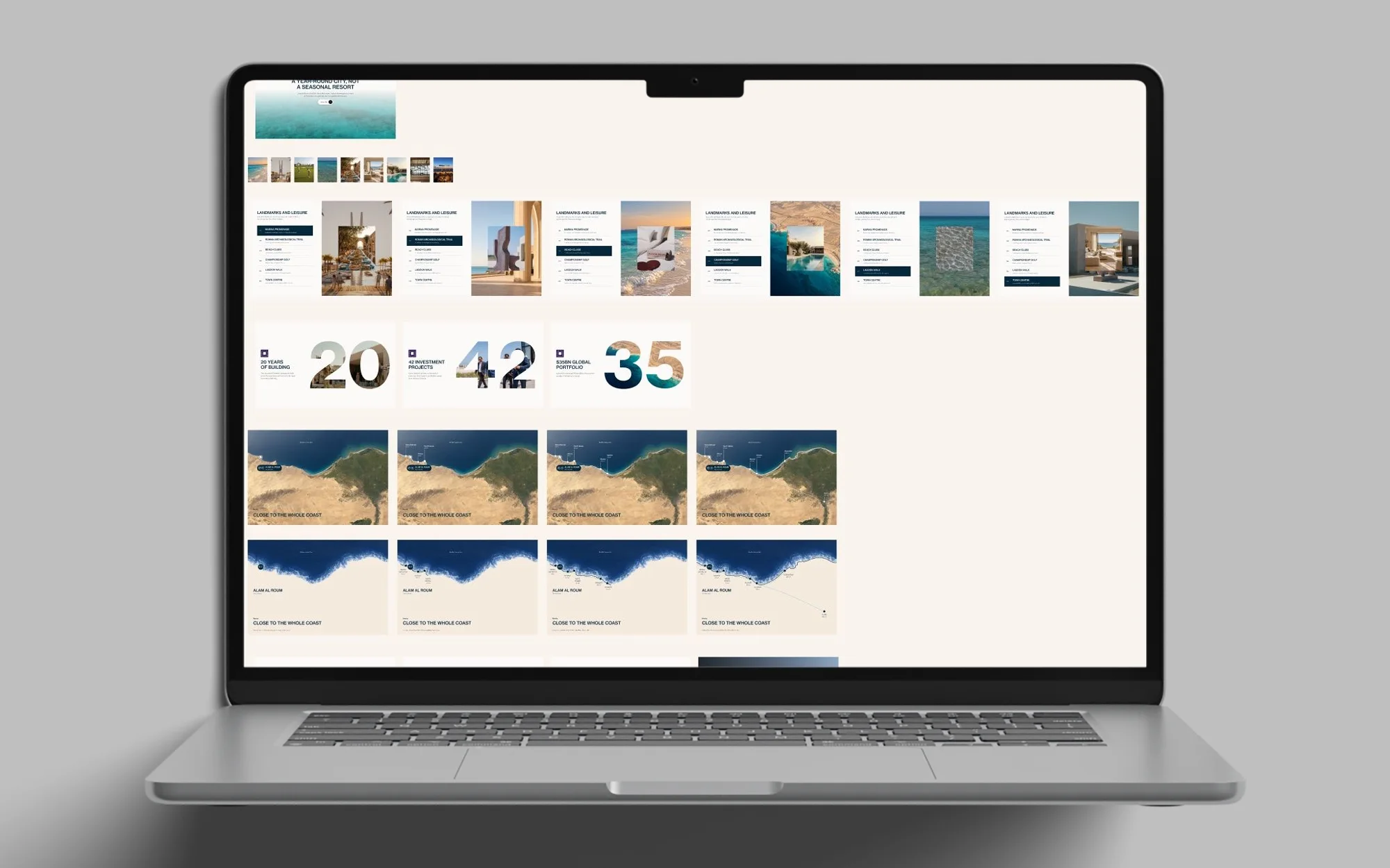
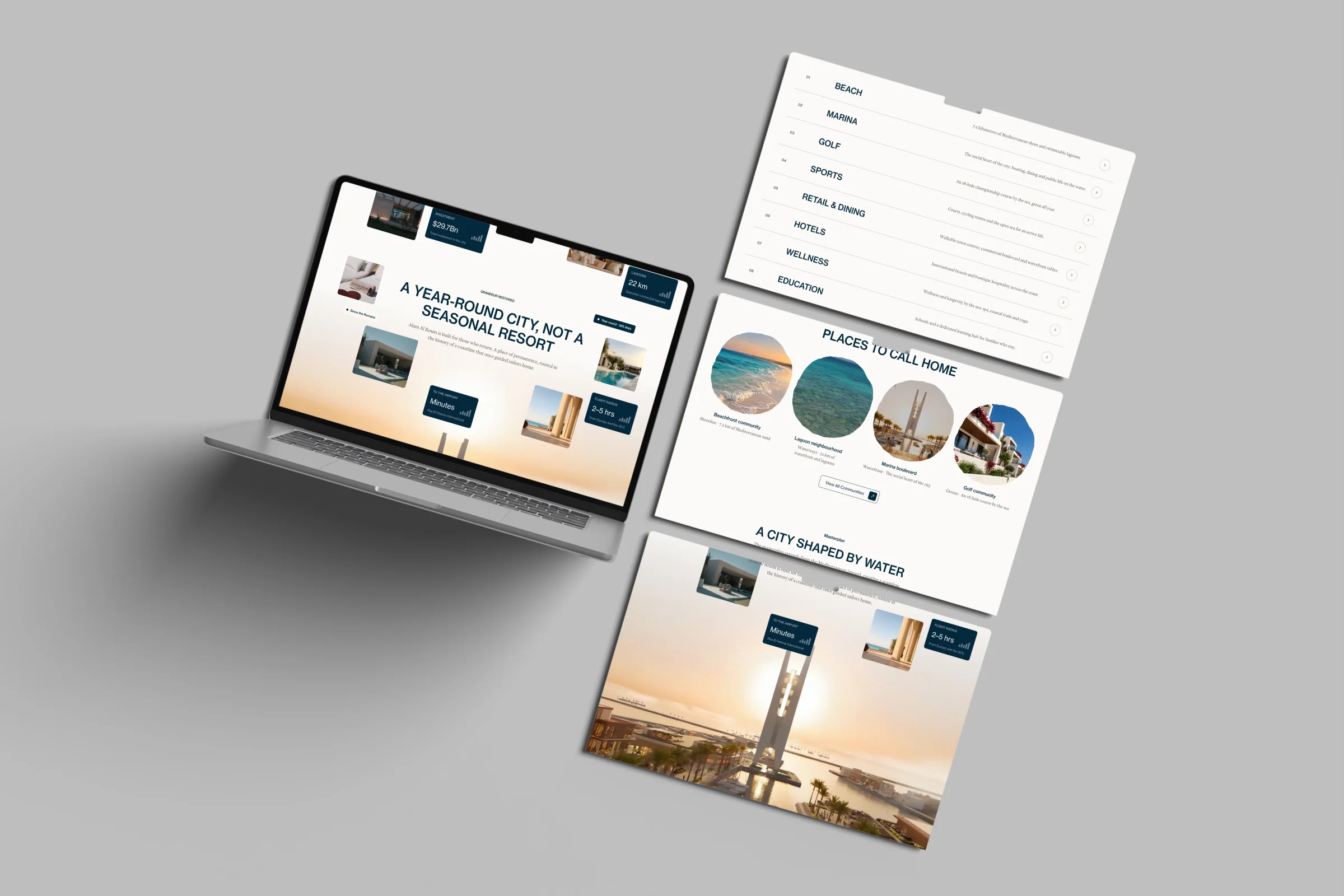
Three artefacts sat side by side: the original site as an untouched reference, a Figma file with the full landing page, wireframes and components, and a Next.js rebuild with all eleven sections.
The Challenge
The original’s JavaScript was obfuscated, with over a thousand encoded string lookups. Nothing could be ported, so every animation in the rebuild had to be written from scratch.
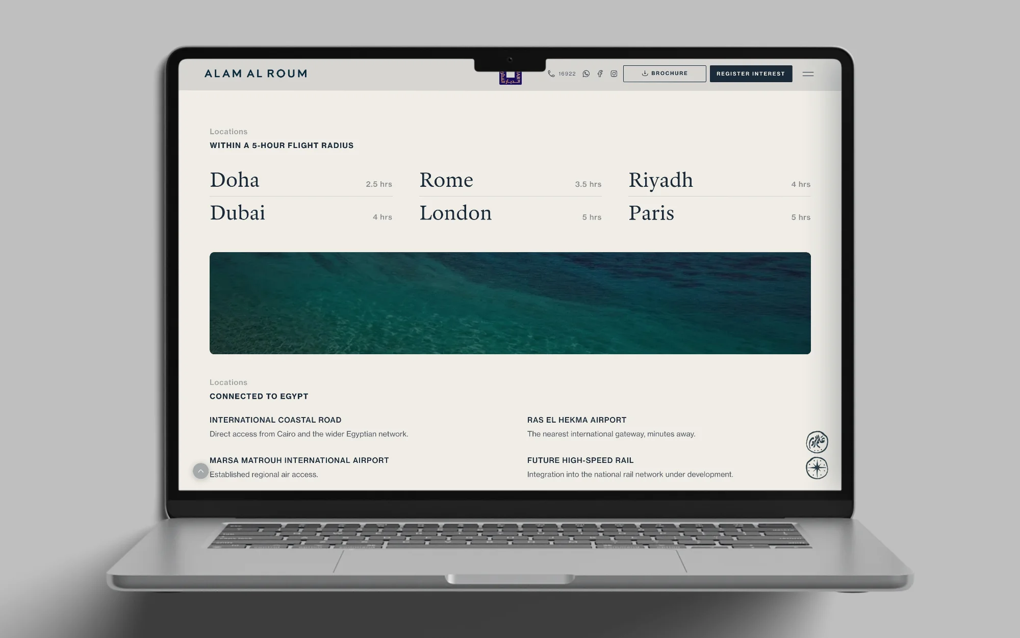
The client also set a rule that overrides pixel-matching: nothing smaller than 16px on desktop and 12px on mobile. The original used 10 to 15px for every small label, so every one of them steps up. That is the biggest visual departure, and it reflows five sections.
Key Decisions
The system was derived from the original, with deliberate deviations.
- A 4px grid for the type scale, from 8 to 48px. The hero headline went from 46 to 48px, which pushed it onto three lines, so its max-width widened to 608px to hold two.
- Tracking is not spacing. Sub-pixel tracking keeps the original’s literal values, outside the grid.
- Five colours, used with restraint: ink and cream carry the page, while rust and teal mark the moments that matter.
- The original set the mobile header CTA at 5px. It moves into the menu instead.
Matched, not eyeballed. I measured the rebuild against the original. The hero headline sits at x 76, y 423, exactly where the original puts it, and the Sequence panel slides to x 877, also exact. Six of the eleven sections match the original height to the pixel. The five that differ are all text-heavy, and they differ on purpose: the client rule won over pixel-matching.
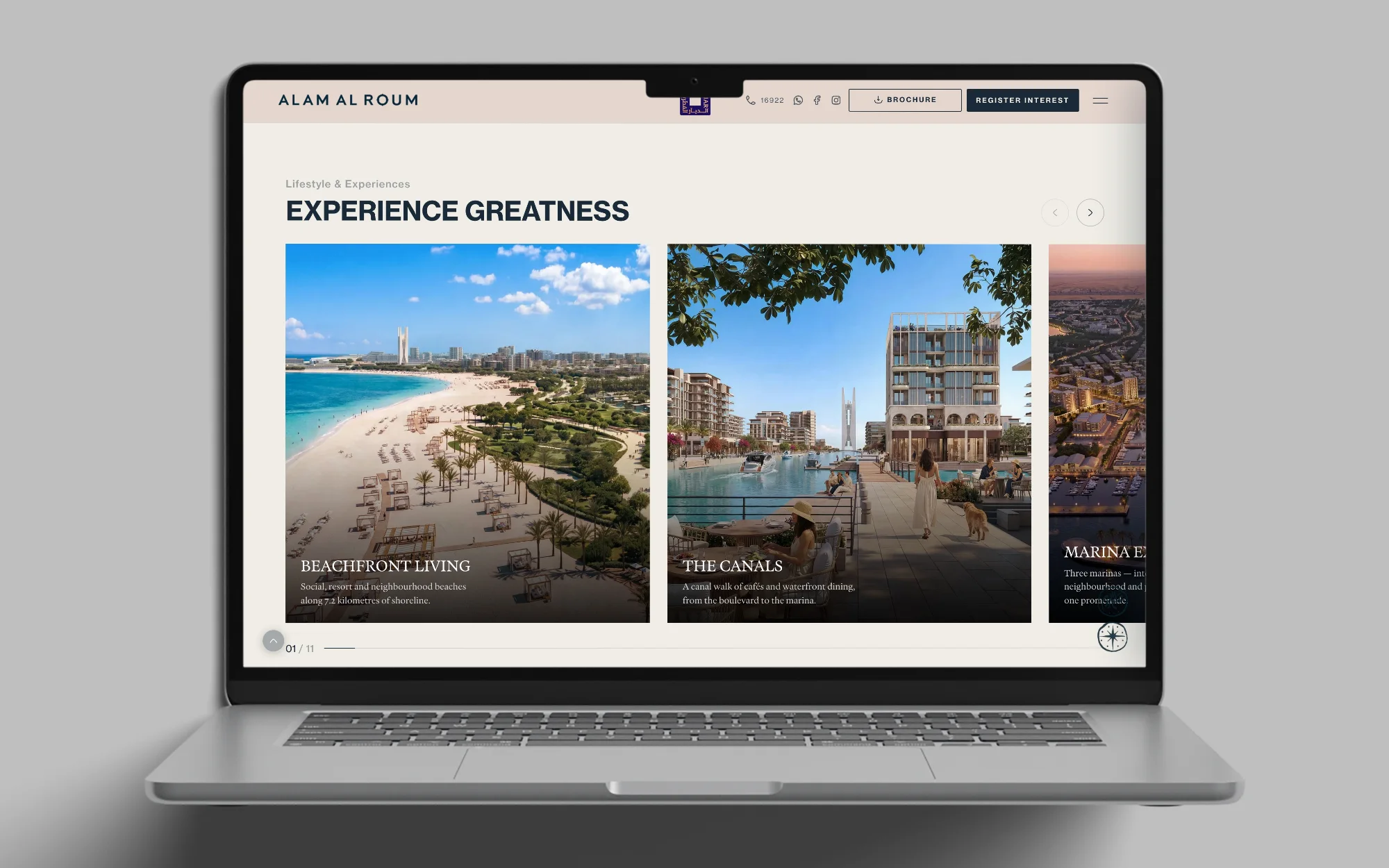
Two components, eleven sections. One pinned-reveal component serves two sections with the same mechanic, and one rail layout renders all eleven lifestyle cards from data. The lifestyle band is one card stack, not eleven sections: absolutely positioned cards with ascending z-index in a single sticky viewport, over a scroll track twelve viewports long.
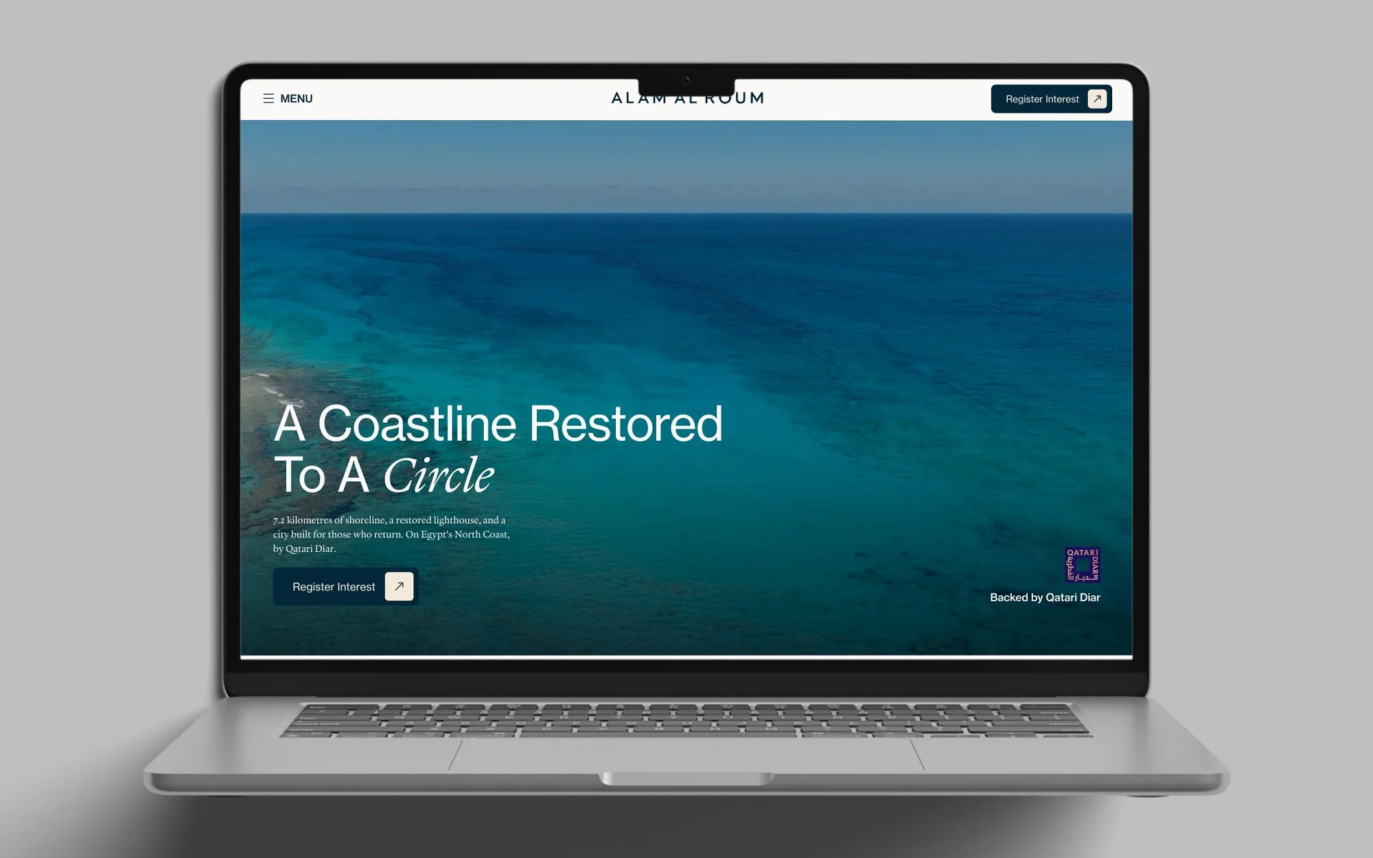
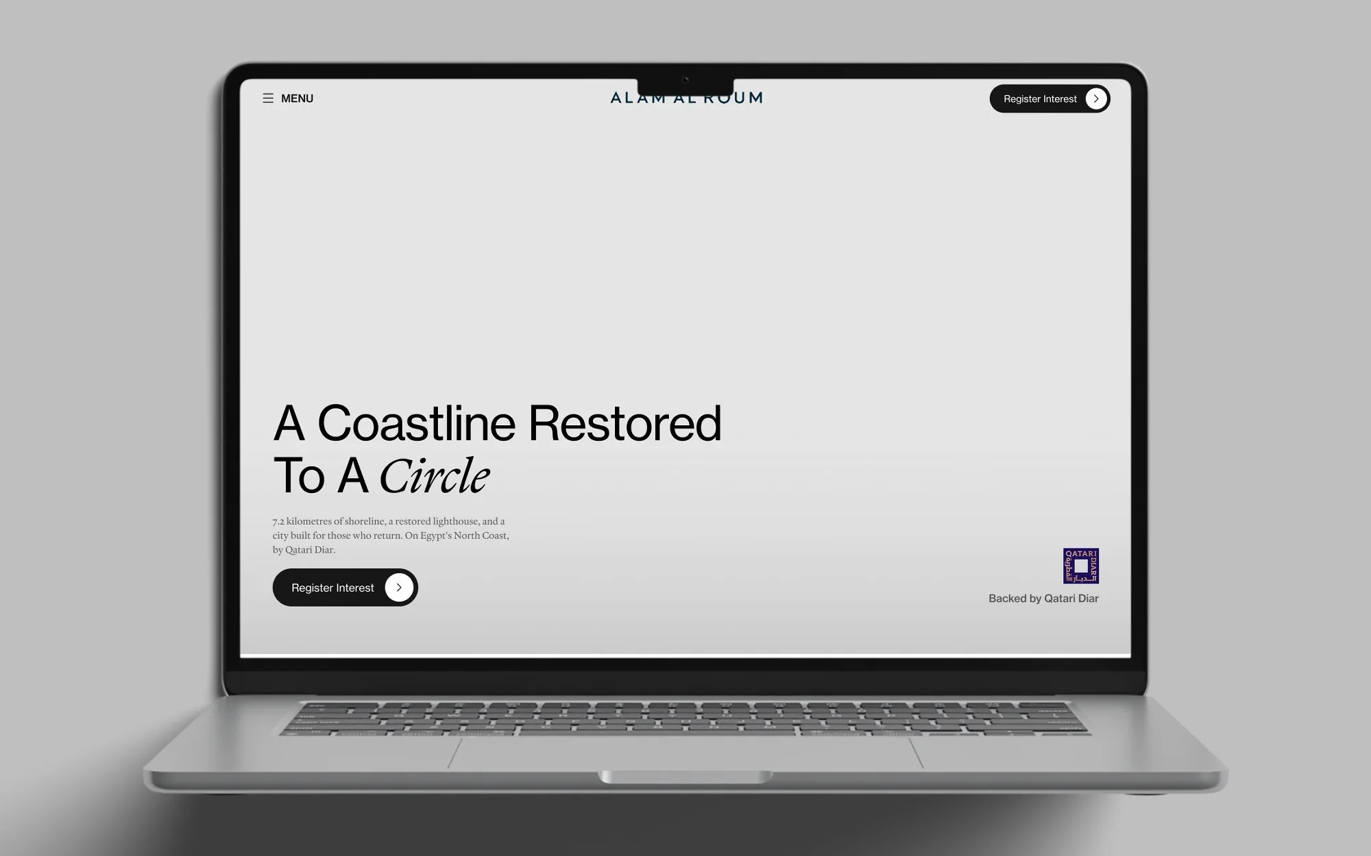
A hero intro the live site never shipped. The hero circles exist in the original markup, but one CSS rule hides them at every width. I rebuilt them from that dead CSS: two organic blobs drift up on cream with ink type, scale away, the photograph fades in and the type flips to white. GSAP and Lenis share one clock, and with reduced motion on, the intro jumps straight to the settled state.
The Screens
Outcome
Designed in Figma and vibe-coded with Claude. All eleven sections are built, and the site is launching soon.
- 11 of 11 sections rebuilt in Next.js, with the App Router and React 19.
- 134px total height difference across a 24,274px page.
- None of the original’s JavaScript was reused, because it was obfuscated. Every animation was written from scratch.
- 16px desktop type floor, applied everywhere.
Pixel-matching is a discipline, not a goal: it tells you exactly where you chose to differ. Writing every animation from scratch meant understanding each one, and that is how I found the intro the original never shipped.
Next time I would keep the Figma file and the code on one system from the start. Here they were knowingly out of sync, and the code was the source of truth.
Client feedback
The client said the work was very aligned with what they had in mind.
Supervised by Mitch at MitchDesigns; the rest of the team built the backend.