
The Brief
Crafted is a burger and fried chicken brand, and its new website is in development. I’m designing the UI, two weeks of work. The site has one job above the rest: people should be able to order quickly, add extras and add-ons, and see the brand on every screen.
The Challenge
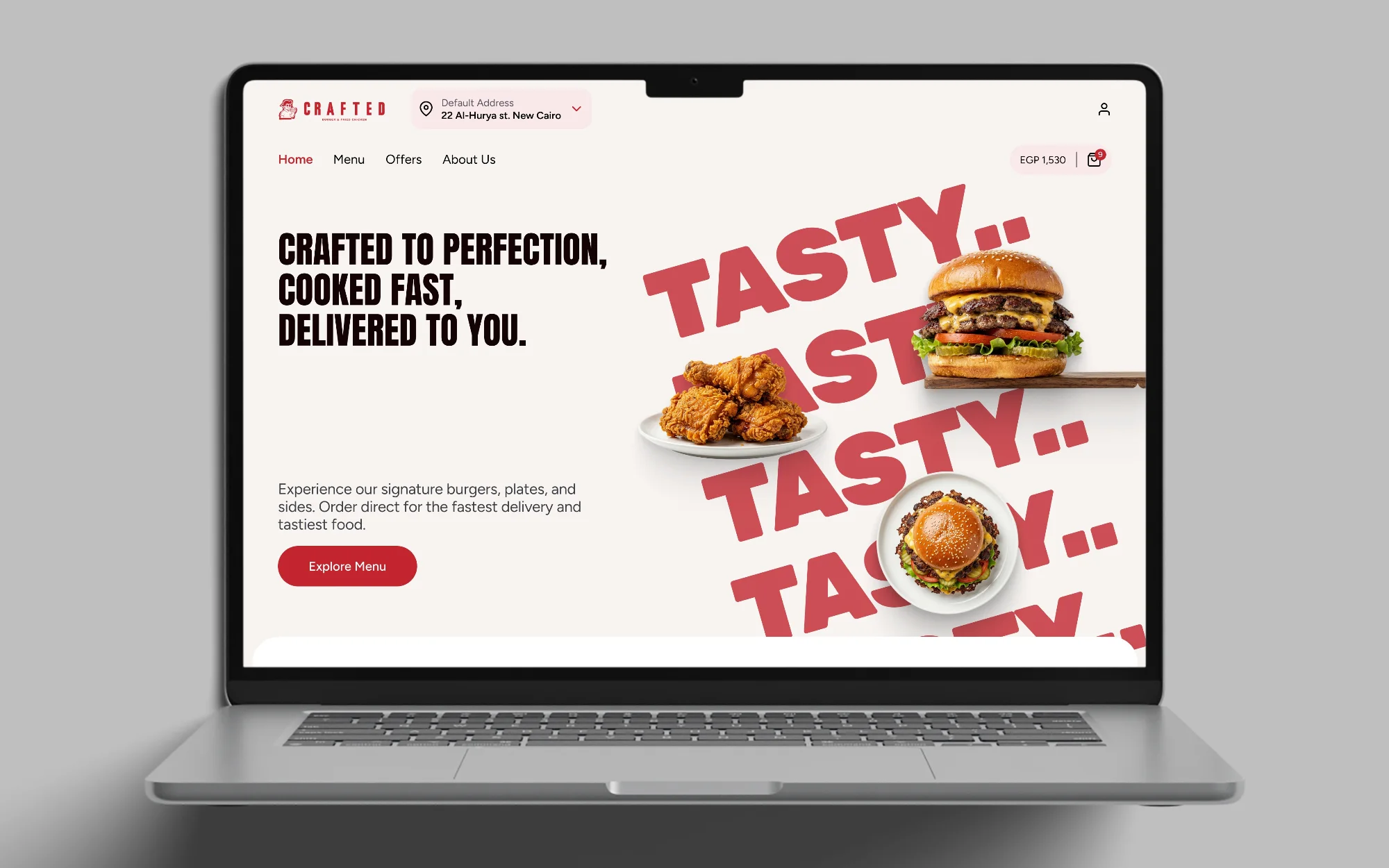
The brand is loud: red headlines, a tilted TASTY graphic and big food photography. The challenge was to keep that energy on the front of the site while the ordering part stays calm and clear, so the order is the easy part.
Key Decisions
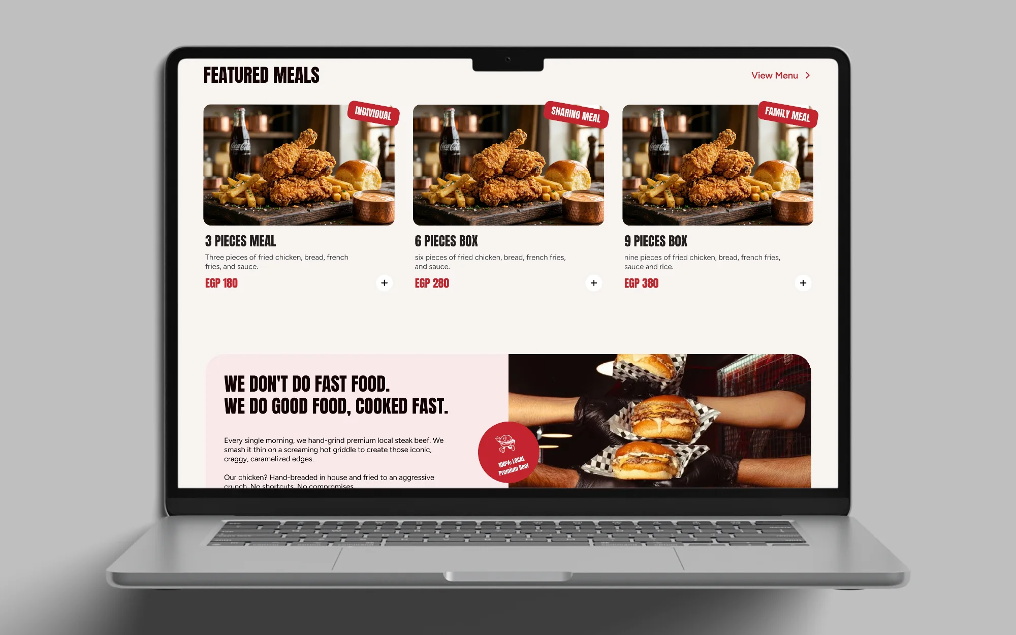
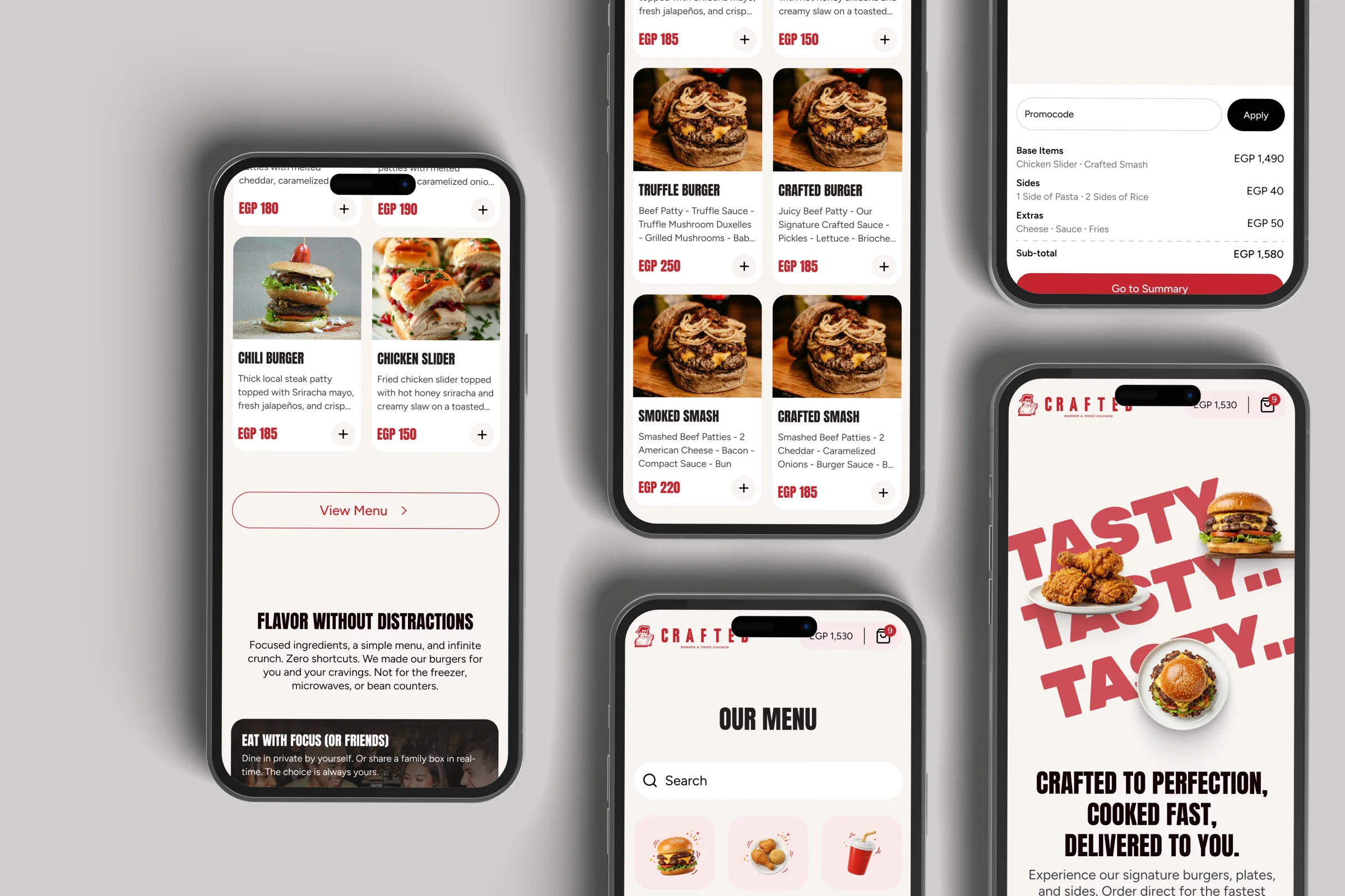
The home page carries the brand. The red type, the cream background and the food photography run down the page from the hero, and the featured meals lead into a band with the brand’s line: we don’t do fast food, we do good food, cooked fast.
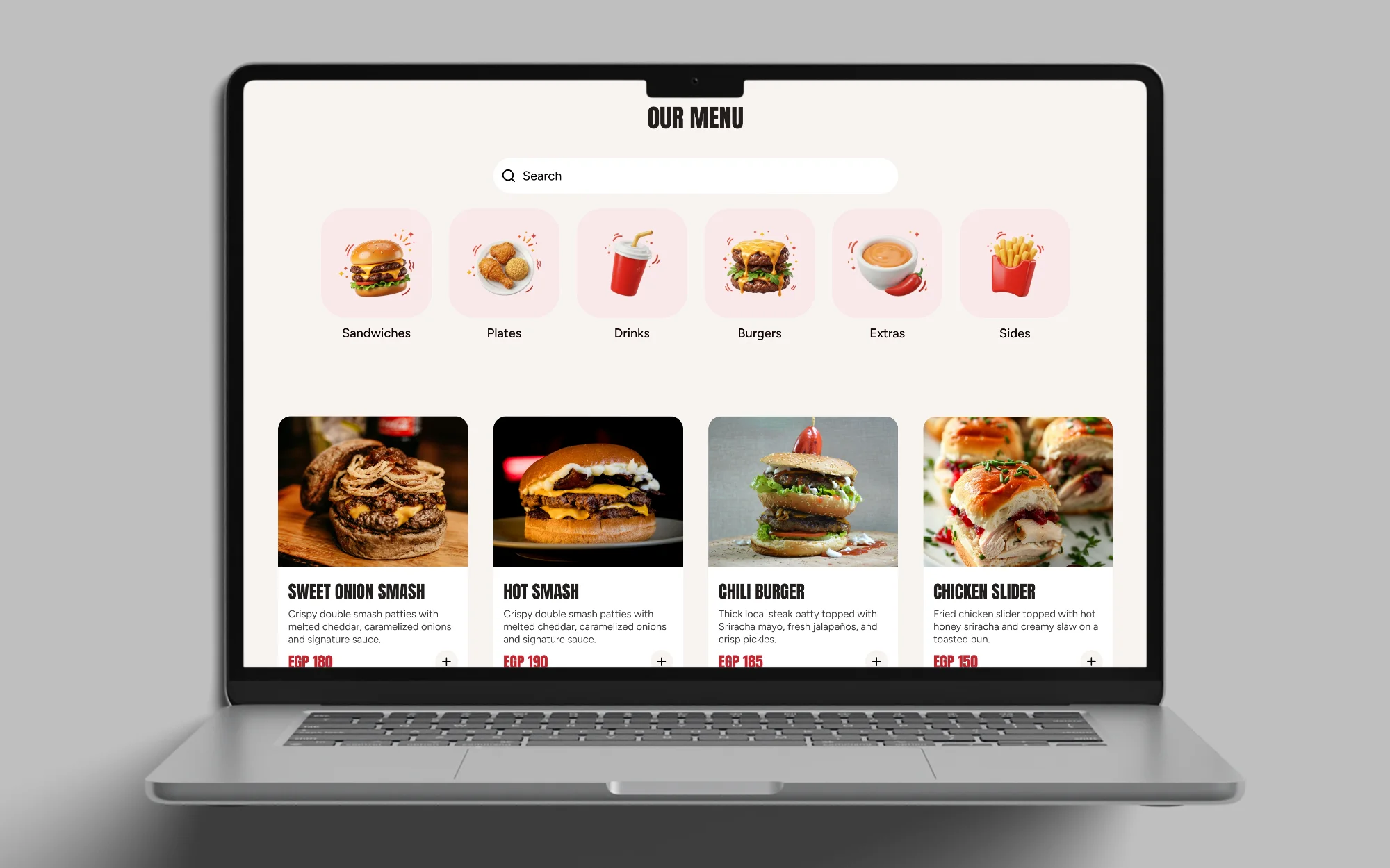
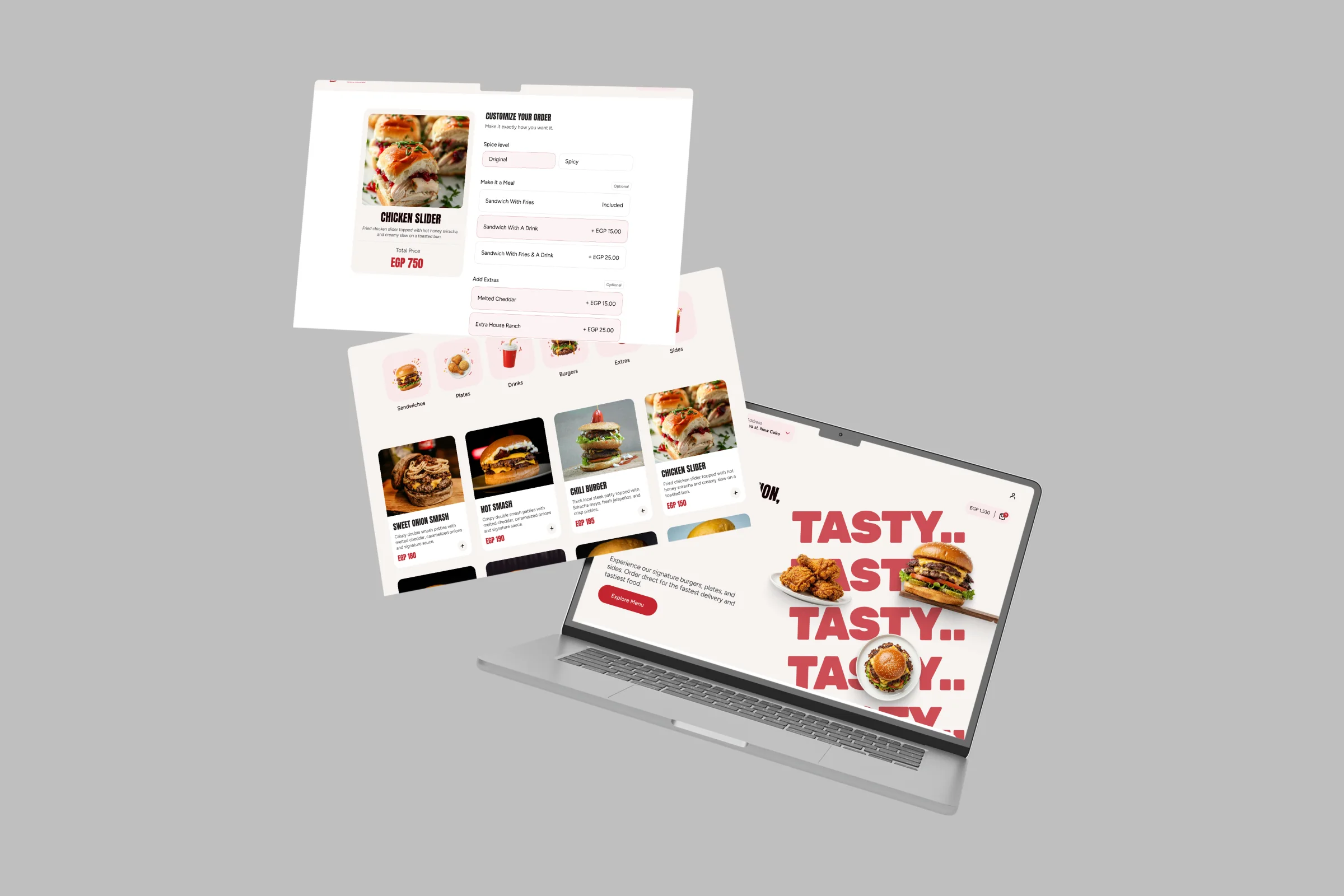
The menu is a grid you can scan. Categories sit as large icons above the products, and each product card shows a photo, the name, a short description, the price and a plus button to add it.
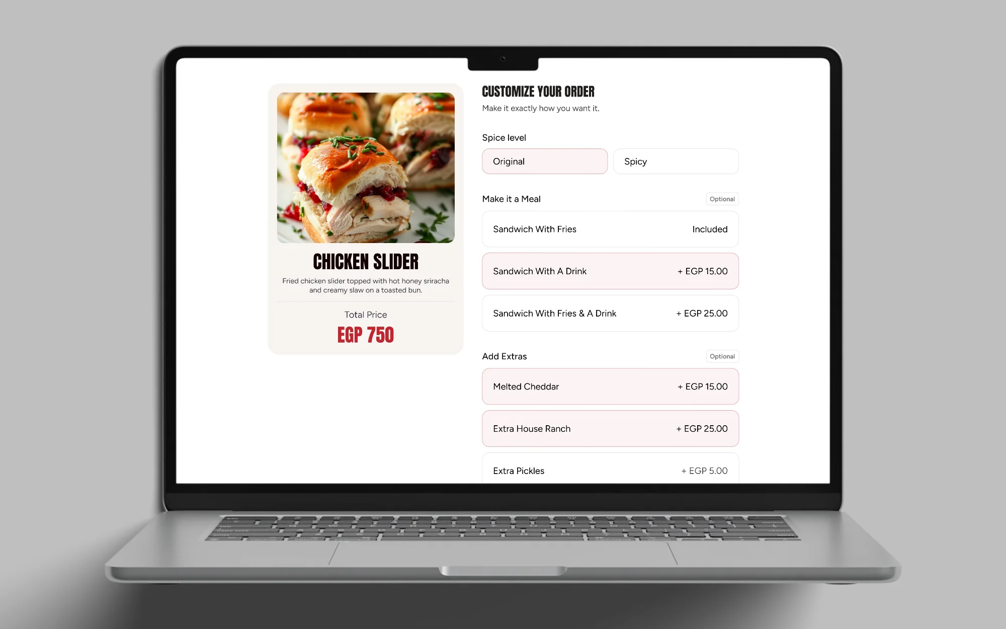
Extras and add-ons are chosen on the product page. It groups the choices: spice level, meal options such as a sandwich with fries or with a drink, extras and add-ons with their prices, and special instructions. Quantity and one add-to-cart button sit at the bottom, and the total stays in the card on the left.
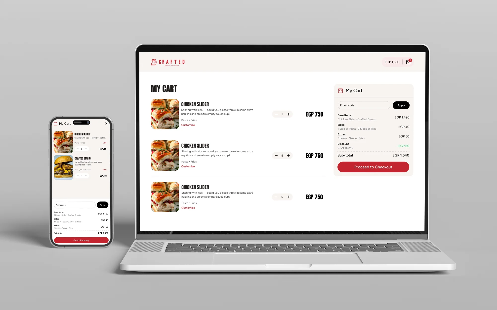
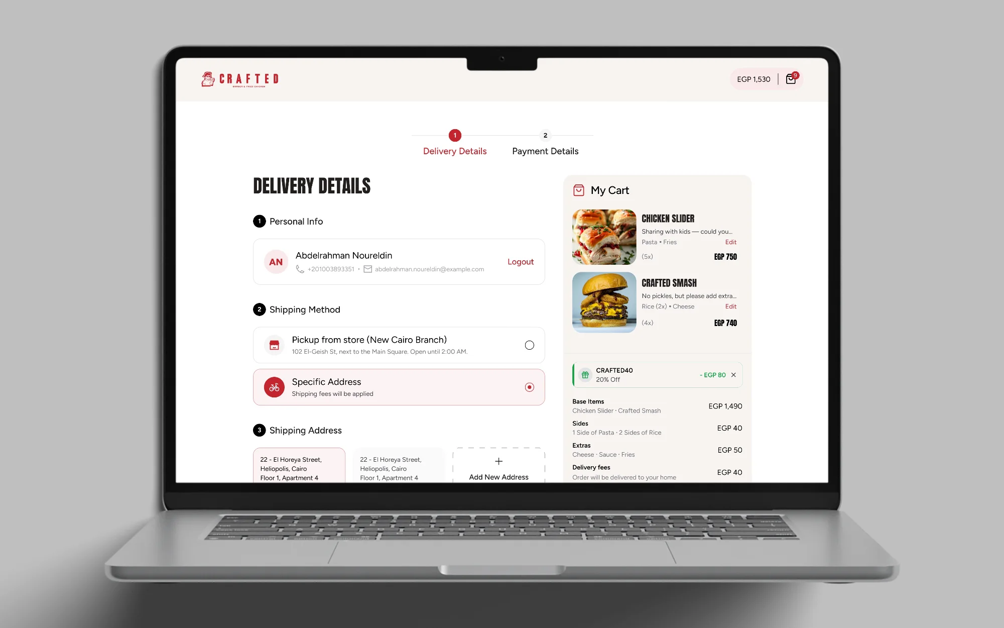
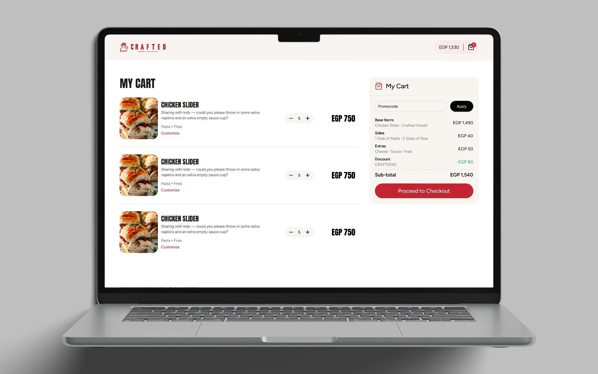
The cart keeps the same grouping. Items are split into base items, sides and extras, each line has an Edit link, and the subtotal and the Go to Summary button close the list.
The Screens
Client feedback
The client liked how easy it is to order and add extras and add-ons, and how closely the visuals match their brand.