Case study / HR software

Vestrise HRMS

Product UI and a design system for an existing HR backend, so the company can sell its HRMS as a product.

In design

Role
Product UI and design system
Through
Direct client
Duration
1.5 months
Industry
HR software

The Brief

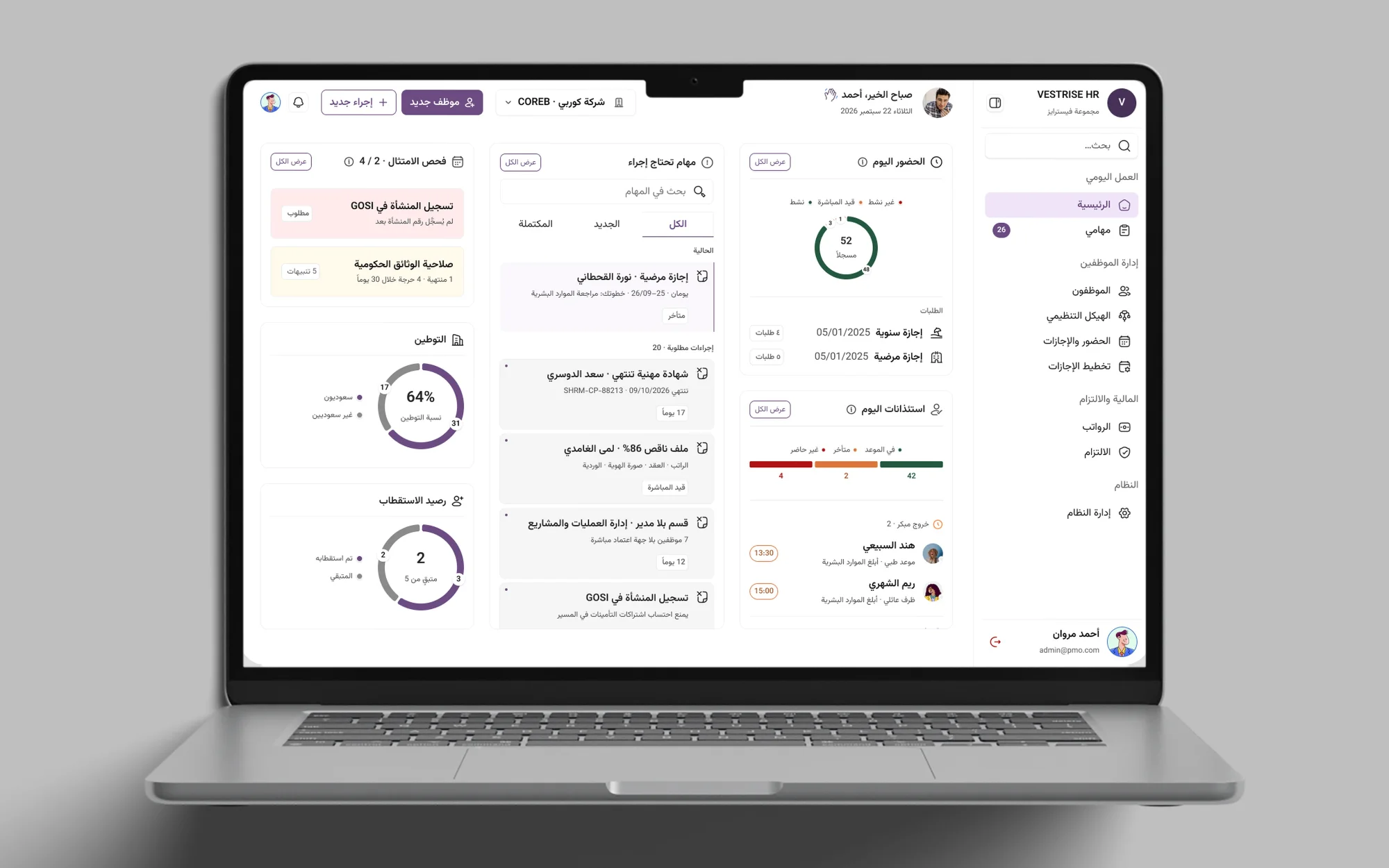
Vestrise HR is an HR management system whose backend already exists. The company wants to sell it as a product, so I’m designing the front end: the product UI and the design system behind it. The home screen at the top of this page is the dashboard, with attendance, tasks that need action, compliance checks and leave requests in one view.

The Challenge

An HR system covers a lot of ground: employee records, attendance and leave, payroll, org structure and documents. The challenge is to make all of it read as one product rather than a set of separate screens, so the same patterns repeat wherever someone goes.

Key Decisions

Directories are tables with a clear status. The employee directory lists each person with their ID, job title, department, file completion and status. Status tabs, a search box and a filter sit above the table, so an HR team can narrow the list without leaving the page.
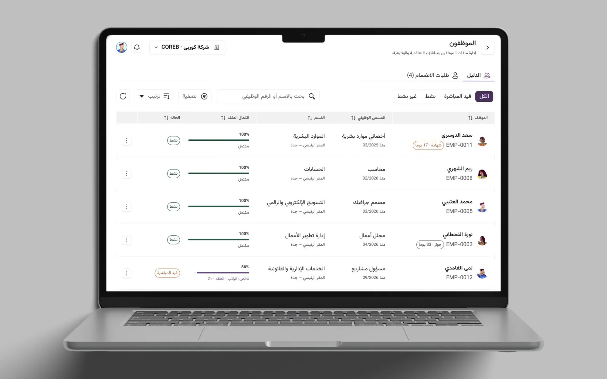
The employee directory table with status tabs, a search box, job titles, departments, file completion bars and status badges
The employee directory: status tabs, search and a table with file completion.
Switching company from the header.

Requests reuse that pattern. The leave table has tabs for all, awaiting approval, approved and rejected, a date range and an action on each row. A waiting column shows who needs to act next: the HR team, a direct manager or the general manager.
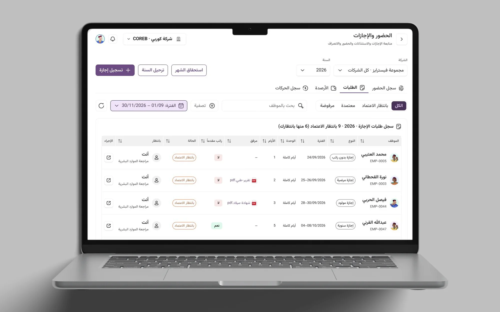
The leave requests table with status tabs, a date range filter, leave types, attachments and a column showing who is waiting
Leave requests use the same tabs and table, with a column for who needs to act.
Registering a leave: the drawer slides in from the side.

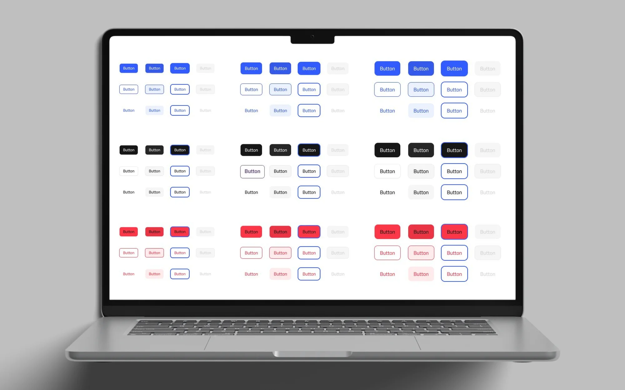
The design system keeps the screens consistent. The components page holds icons, buttons, form fields, navigation, data tables, overlays and HRMS-specific pieces. The buttons come in blue, black and red, each as a solid, outline or text style, in three sizes, with icon-only and faded versions.

The Screens
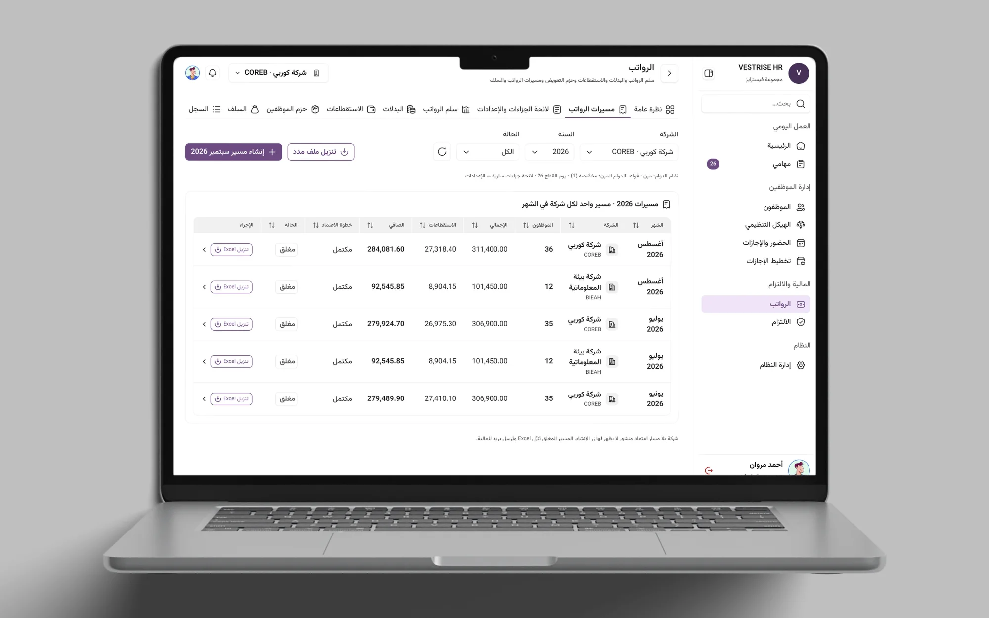
The payroll runs page: a table of monthly payroll runs per company with their totals and status
Payroll runs, one row per company and month.
Creating a payroll run.
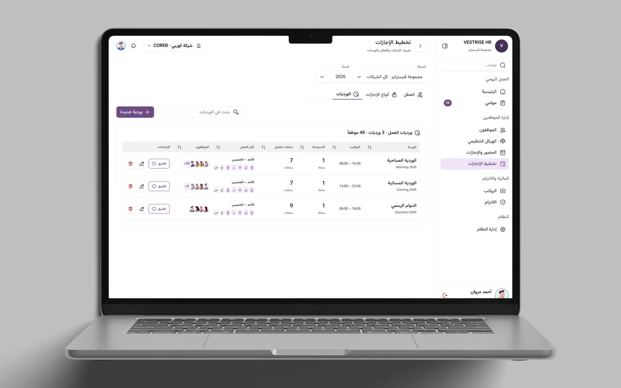
The shifts page: the work shifts with their hours, days and assigned employees
Shifts: hours, days and who works them.
Adding a shift: the modal opens over the list.
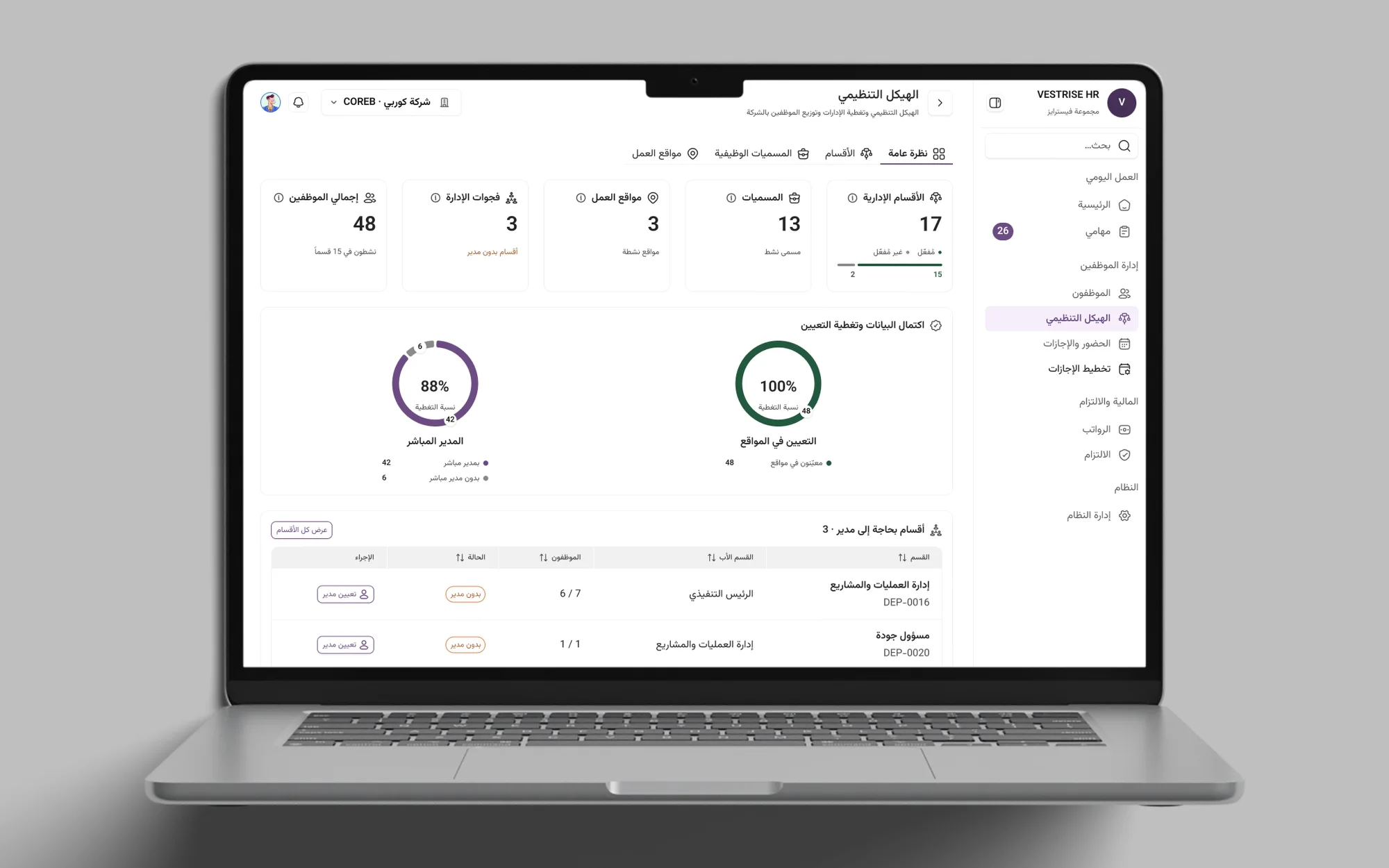
The organisation structure overview: headcount figures, two progress rings and the departments that need a manager
The organisation structure at a glance.
Scrolling down to the departments that need a manager.
The HR dashboard: attendance, leave requests, tasks and documents that need attention
The dashboard: what needs attention today.
Buttons from the components page in blue, black and red, each in solid, outline and text styles, in three sizes, with faded states
The buttons from the components page, in every colour, style and size.

Status

In design. The product UI and the design system are still in Figma, and the project runs for 1.5 months. Nothing here is live yet.
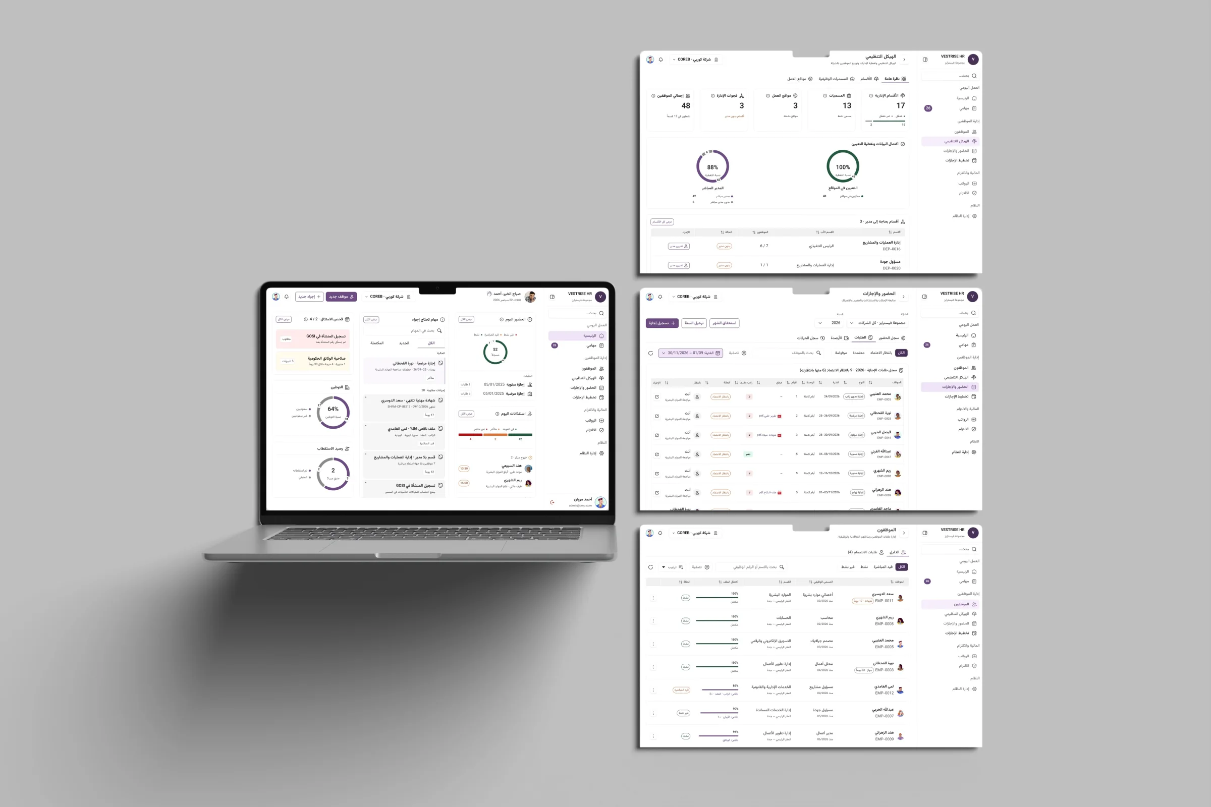
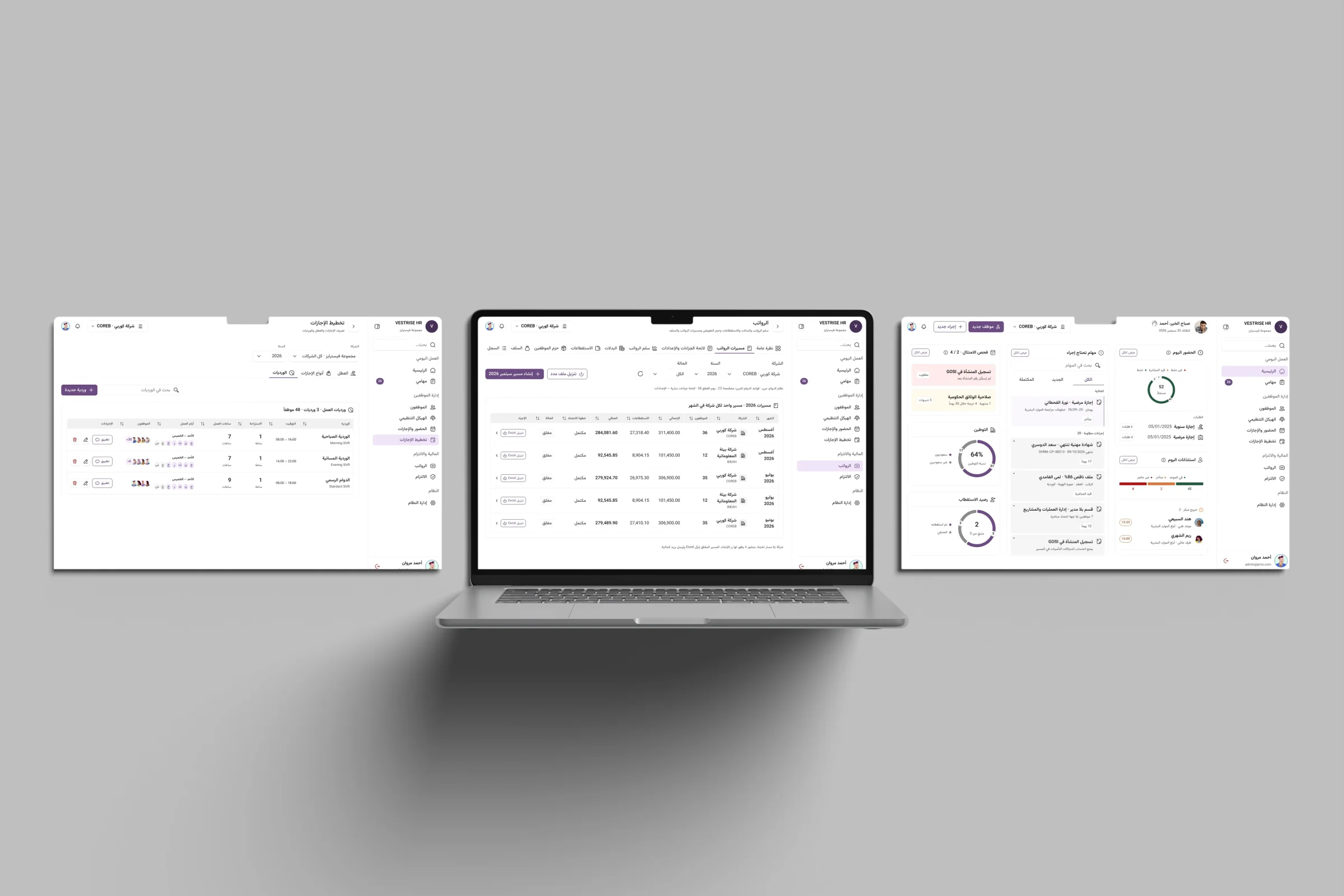
Vestrise HRMS screens on a laptop and screens
The dashboard, employees, leave and structure.
Vestrise HRMS screens on a laptop and screens
Payroll, shifts and the dashboard.